

Geschenkbox
The Art of Gift Boxes: A Thoughtful Expression of Care and Celebration Gift boxes are more than just containers; they are a symbol of thoughtfulness, celebration, and connection. Whether given for birthdays, holidays, weddings, or corporate events, a beautifully designed gift box enhances the experience of both giving and receiving. The right gift box can elevate even the simplest present into a memorable gesture, making the recipient feel truly valued. A well-crafted gift box begins with its design. The exterior often features high-quality materials such as sturdy cardboard, luxurious velvet, or eco-friendly recycled paper. Some boxes are adorned with elegant patterns, embossed details, or metallic foiling to create a sense of sophistication. The color palette plays a crucial role—soft pastels convey warmth and tenderness, while bold hues like deep red or gold evoke excitement and grandeur. The unboxing experience is carefully considered, with magnetic closures, ribbon ties, or satin linings adding a touch of elegance. Inside, the arrangement of items is just as important. Thoughtful organization ensures that each component is presented beautifully. Many gift boxes include layers of tissue paper, custom inserts, or compartments to keep items secure and visually appealing. Some feature personalized notes or engraved messages, adding an extra layer of sentiment. The contents can range from gourmet treats and fine chocolates to skincare sets, candles, or curated collections tailored to the recipient’s interests. Sustainability has also become a key focus in gift box design. Many brands now use biodegradable, reusable, or recyclable materials to minimize environmental impact. Wooden boxes, fabric wraps, and plantable seed paper are popular eco-conscious alternatives that still deliver a luxurious feel. Ultimately, a gift box is a reflection of care and attention to detail. It transforms an ordinary exchange into a meaningful moment, leaving a lasting impression. Whether simple or extravagant, the perfect gift box speaks volumes, conveying emotions that words alone cannot express.
Produkt
Kategorie:
-
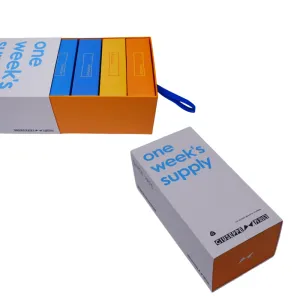
George White Verpackungsbox
Ihre Klassifizierung: Andere ProduktverpackungskartonsAnsichten: 1029Nummer:Veröffentlichungszeit: 2025-09-23 09:32:49Die Verpackung dieses Produkts weist eine klassische rechteckige Prismenstruktur mit klaren Linien und einer klar definierten Form auf. Es maximiert nicht nur die Platzeffizienz für bequemen Transport und Lagerung, sondern vermittelt auch einen stabilen, professionellen optischen Eindruck. Die gesamte Farbstrategie konzentriert sich auf reines Weiß, das großflächig aufgetragen wird, um einen hellen, klaren und modernen Ton zu erzeugen, der Professionalität und Zuverlässigkeit symbolisiert. Am Boden der Box ist ein dezenter orangefarbener Akzent kunstvoll integriert. Dieser lebendige, warme Farbton bildet einen markanten und dennoch harmonischen Kontrast zum dominierenden Weiß. Es durchbricht die potenzielle Monotonie einer einfarbigen Palette und verleiht dem minimalistischen Design Zugänglichkeit und Energie, was auf den proaktiven und innovativen Geist der Marke in ihrem professionellen Bereich hinweist. Der visuelle Blickfang auf der Vorderseite ist der klar aufgedruckte blaue Text „Vorrat für eine Woche“. Dieser Ausdruck, der wörtlich „Vorrat für eine Woche“ bedeutet, ist äußerst funktional und ermöglicht es den Verbrauchern, den Nutzungszyklus und die Kapazität des Produkts sofort zu verstehen. Die Wahl von Blau vermittelt Ruhe und Rationalität; In Kombination mit dem weißen Hintergrund wirkt es außergewöhnlich klar und lesbar und verkörpert das zentrale Gestaltungsprinzip der Einfachheit und der Priorisierung der funktionalen Kommunikation. Diese direkte Informationsbereitstellung reduziert effektiv den kognitiven Aufwand für Verbraucher und verbessert die Benutzerfreundlichkeit. Markeninformationen sind auf der Seitenwand der Box konzentriert. Hier ist der Markenname „GIUSEPPE 乔治白“ sowohl auf Chinesisch als auch auf Englisch deutlich sichtbar gedruckt, um eine genaue Markenbekanntheit und internationale Anziehungskraft zu gewährleisten. Gleichzeitig unterstreicht der Slogan „THE LEADING BRAND IN UNIFORM“ selbstbewusst die Führungsposition der Marke im Uniformsektor und vermittelt den Kunden professionelle Glaubwürdigkeit und Markenstärke. Darüber hinaus wird das grafische Logo der Marke zusammen mit Textelementen präsentiert und bildet zusammen ein vollständiges und standardisiertes Markenidentitätssystem. Die auf dieser Verpackungsschachtel verwendete Prägedrucktechnik ist entscheidend für die verbesserte Textur. Bei diesem Verfahren werden präzisionsgefertigte Matrizen verwendet, um erhabene, strukturierte Reliefeffekte auf dem Substrat zu erzeugen. Auf das Markenlogo oder wichtige Textelemente aufgetragen, erzeugt es durch Schattenvariationen unter Licht fühlbare, dreidimensionale Muster – auch ohne Tinte. Dieses haptische Erlebnis hebt die Verpackung über die Flachheit hinaus und verleiht ihr eine subtile, raffinierte handwerkliche Qualität. Aufbauend auf dem Minimalismus erreicht es eine Verfeinerung im Detail. Zusammenfassend lässt sich sagen, dass dieses Verpackungsdesign das Prinzip „Form folgt Funktion“ erfolgreich verkörpert. Durch den Verzicht auf überflüssige Verzierungen erreicht es durch strukturierte Formen, kräftige Farbkontraste, geradlinige Typografie und strukturierte Prägungen eine klare, effiziente Ästhetik. Es vermittelt präzise die Kerninformationen des Produkts und die professionelle Positionierung der Marke und passt perfekt zur klaren, funktionalen Ästhetik, die für den Geschäfts- und Uniformbereich erforderlich ist. Während es grundlegende Schutzfunktionen erfüllt, unterstreicht es durch durchdachte Details auf subtile Weise das Qualitätsbewusstsein der Marke. -
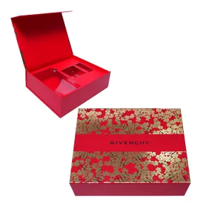
GIVENCHY-Verpackungsbox
Ihre Klassifizierung: Andere ProduktverpackungskartonsAnsichten: 969Nummer:Veröffentlichungszeit: 2025-09-23 09:32:58Bei der Verpackung dieses Produkts kommt eine raffinierte Kombination aus zwei Drucktechniken zum Einsatz: Mattlaminierung und Folienprägung, die zusammen für eine außergewöhnliche Textur und optische Attraktivität sorgen. Zunächst wird die gesamte Kartonoberfläche mit einer Schicht zarter Mattfolie überzogen. Dieser Prozess erhöht nicht nur die Haltbarkeit der Verpackung erheblich und bietet praktische Funktionen wie Kratzfestigkeit und Fingerabdruckfestigkeit, sondern – was noch wichtiger ist – verleiht der Oberfläche ein weiches, dezentes mattes Finish. Diese Textur fühlt sich warm und glatt an und erinnert an die feinen Stoffe, die für hochwertige, maßgeschneiderte Kleidung verwendet werden. Es verleiht der Verpackung sofort einen dezenten, luxuriösen Touch, vermeidet die Billigkeit, die oft mit glänzenden Oberflächen verbunden ist, und präsentiert gleichzeitig eine raffinierte und anspruchsvolle Ästhetik. Auf dieser matten Grundierung ist das Design mit einer umwerfenden Heißfolienprägung versehen. Der Kofferaufbau ist in sattem, authentischem Rot gehalten – ein Symbol für Leidenschaft und Glück, das auch klassische Vornehmheit vermittelt. Ergänzt wird dieses Rot durch sorgfältig gestaltete goldene Blumenmuster. Diese Muster werden nicht nur gedruckt, sondern durch präzises Heißfolienprägen erzielt, bei dem Metallfolie fest an der Schachteloberfläche haftet und blendend leuchtende, scharf definierte dreidimensionale Motive erzeugt. Die Kombination von Rot und Gold stellt eine zeitlose Kombination in der Farbästhetik dar – ersteres beständig und feurig, letzteres brillant und opulent. Zusammen bilden sie einen markanten und zugleich harmonischen visuellen Kontrast, der den Luxus und die künstlerische Wirkung der Verpackung deutlich unterstreicht und sie auf den ersten Blick unvergesslich macht. Das Layout der Box ist besonders raffiniert. In der visuellen Mitte verläuft ein rotes dekoratives Bandmuster, ein Designelement, das geschickt vom Bandstil hochwertiger Geschenkboxen inspiriert ist und für mehr Tiefe und ein Gefühl von Zeremonie sorgt. Oberhalb des Bandes ist der Markenname deutlich in Schwarz aufgedruckt. Die Wahl von Schwarz ist meisterhaft umgesetzt. Als stärkste neutrale Farbe wirkt sie vor dem rotgoldenen Hintergrund außergewöhnlich stabil und auffällig. Dadurch wird die Markenbekanntheit effektiv gesteigert und gleichzeitig die visuelle Unordnung vermieden, die andere Farben verursachen könnten, sodass die Gesamtästhetik rein und anspruchsvoll bleibt. Insgesamt erreicht das Verpackungsdesign eine perfekte Balance zwischen Stärke und Weichheit, Tradition und Moderne. Das Blumenmotiv bildet den krönenden Abschluss – seine zarten Linien und romantischen Formen verleihen der Premium-Ästhetik einen Hauch von Anmut und Wärme und verhindern so ein zu starres oder formales Erscheinungsbild. Dadurch strahlt die Verpackung Luxus aus und behält gleichzeitig eine emotionale Anziehungskraft. Bei dieser raffinierten und eleganten Designsprache, von der dezenten Textur der matten Folie über die schillernde Brillanz der Folienprägung bis hin zur klassischen Farbkombination aus Rot, Gold und Schwarz, ist jedes Detail sorgfältig durchdacht, um gemeinsam eine herausragende visuelle Wirkung zu erzielen. Es ist mehr als nur ein Verpackungsgefäß, es dient als Erweiterung der Identität der Marke und passt perfekt zu ihrer inhärenten Mode- und Luxus-DNA. Dieses Design unterstreicht erfolgreich das erstklassige und edle Image der Marke in den Köpfen der Verbraucher.


Nachrichten
Kategorie:
Keine Suchergebnisse!
Fall
Kategorie:
Keine Suchergebnisse!
Video
Kategorie:
Keine Suchergebnisse!
Herunterladen
Kategorie:
Keine Suchergebnisse!
Rekrutierung
Kategorie:
Keine Suchergebnisse!
Empfohlene Produkte
-
NEWS
George White Verpackungsbox
Erfahren Sie mehr -
NEWS
GIVENCHY-Verpackungsbox
Erfahren Sie mehr


 Telefon